As we did at Strava, I'll be referring to users as athletes. You don't have to be a pro or even competitive — if you move your body, you're an athlete.
For athletes, regular mapping tools in Google Maps or Open Street Map just don't cut it. Traditional maps are built for cars and don't consider athletes' needs - using trails, avoiding dangerous areas, managing elevation, or testing your skill at popular run or ride spots, for example. Whether trying to stay active while traveling or planning a group activity, athletes need more.
In 2013 I had the privilege of working on my Strava dream feature - Routes. Strava's route feature uses anonymized athlete data to help you quickly and easily plan activities and share them with friends.
As Strava's user base grew and their uploaded collective activities (rides and runs) multiplied exponentially, we had amassed an immense amount of data to help visualize and suggest routes that other athletes might choose. By combining data with powerful, athlete-specific tools like elevation maximization/minimization or avoiding roads to focus on trails, Strava had the chance to provide athletes with a mapping tool built just for them.

The idea started pretty simply: if you create a heat map using anonymized ride and run data, you can tell where real athletes choose to run and ride — and maybe more importantly, the spots they avoid as well.
As a Product Manager and Designer at Strava focused on engagement, I was beyond excited about this data's potential. With a small team (myself as PM and Product Designer, two infrastructure engineers, and three full-stack engineers), we split our work into two pieces. There was a lot of engineering research and experimentation to do, so while the team worked on some initial prototypes of heatmaps and basic mapping functionality, I began my research - learning the ins and outs of existing athlete-focused mapping tools like MapMyRide/Run and talking to athletes to learn more about how they plan cycling and running routes.
Once this research was complete, I used it to generate a series of user scenarios representing the most common experiences of cyclists and runners when planning activities. Some athletes focused on creating challenging routes that would test their skill and endurance, while others were interested in the social components of activities - where to meet, get coffee, and eat along the way. To make these user scenarios easy to scan and read, I broke them into simple steps, as shown below.

Text-based scenarios are useful and can inform the team of the needs of various types of athletes. Still, to get the team and the entire company excited about the possibilities of routes on Strava, I took one of the user scenarios and created a storyboard sketch that I presented to the whole company.
The storyboard tells the story of a San Francisco-based cyclist, Josh, who is planning a weekend away with his friends in Tahoe. In this scenario, Josh jumps onto the Strava website, loads a route planning tool that allows him to search for a location, and sees popular Segments (a Strava term for stretches of road/trail that athletes can compete to see who has the best times). Josh then builds a route that includes a Segment close to Lake Tahoe, saves the Route, downloads it to his bike computer, and sends it to his friends.

To create the storyboard, I used a paper sketching technique to create and cut out individual UI elements on separate pieces of paper so combined, moved around, and iterated on quickly.
The company presentation had its intended effect - an excited team and lots of support for the work ahead of us. Most of the features developed for Strava until this point had been competitive. Still, this feature set had the potential of engaging athletes as a community — sharing their experiences, not after the fact, but by bringing Strava into the planning phases — what happens before that activity.
To create a robust route planning feature on Strava, I had to think beyond just how a route planning tool might work, but where all of these routes would live on Strava (web, iOS and Android apps), and how they might be shared with athletes on and off Strava as well.
In short, there was a need for a:
In general, I saw two significant areas of focus emerge:
Eventually, we'd need to build both of these. Still, the first step was understanding how to prioritize and design these two focus areas - and determining the feasibility of all the exciting features and tools we could provide athletes. In the early days of Strava, most of us working there were cyclists or runners. We had a ton of passion and excitement for Strava and wanted to do and build everything. To avoid a situation where we embarked on a tool that would take years to deliver, the team and I did ranking and feasibility exercises to determine where we'd focus our efforts.
Questions that emerged from those early sessions helped refine the scope of the entire project:
In the end, we arrived at a feature set we were confident in, a four-month design and development timeline, and an agreement that the team (design and engineering) would iterate together daily, sharing designs, prototypes, and other works in progress for constant feedback and iteration.
To get started on a simple design for Strava's route planning tool, which we called the Route Builder, I took my storyboard sketches and chatted with the engineering team about the specifics of features that athletes might get the most excited about - seeing popular paths on a map to help plan, integrating routes, adding points of view markers on a map for stops (lunches, coffee, photo opportunities, etc.), choosing to avoid or favor steep elevation, etc.
During these discussions, I ran sketch exercises where we talked through our user scenario with Josh and added more detail to the interactions and route builder tool itself.

These sketches were created with the team present, talking through mapping interactions. While one team member talked through a step in the scenario, I'd sketch the UI, and we'd iterate on these low fidelity sketches together. The sketches were created using Microsoft OneNote on a Surface tablet, making it easy to project the screen to a big monitor where everyone could see the drawings form and give feedback or suggest alternate approaches.
There was real value in doing this with our entire project team in the room - with a technically complex tool like the Route Builder, insights and ideas from engineers helped surface some of the most competitive features Strava might be able to offer.
Sketches like this aren't precious artifacts, so they're easy to scrap, redo, and refine. They allow you to explore variants or alternate approaches quickly.
Outside of the sketch sessions, engineers worked on a Route Builder prototype using the sketched UI as a guideline while I converted the scenario sketches into detailed wireframes.

I maintained a set of wireframes that explored the Route Builder features and used version control to ensure that my team always had the most recent version of the wireframes available to reference.
Through team feedback, design reviews, and the refinement of our engineering prototype, I'd also revisit my user scenario with cyclist Josh to see how the scenario played out with the developing tool. Was the scenario still able to be completed? How was it changing? What opportunities were emerging to make this experience more engaging for Josh?
Throughout this process, I loved how decisions were informed both by design iteration and engineering prototypes. There was no hand-off process, and there was a single team working together to create the best experience possible for athletes.
Over time, our prototype developed into the actual working Route Builder feature. The wireframes became a source of truth for all the complex functionality and interactions that are a part of a mapping tool. I'm great at telling a story that communicates a high-level vision for an experience but also love getting into the nitty-gritty details.
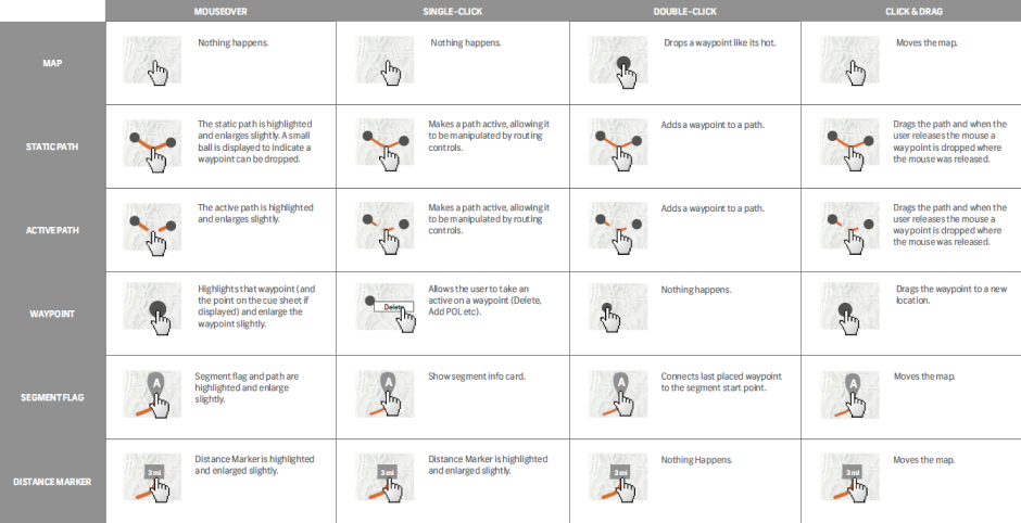
One example of this is accounting for the complex user interactions in a mapping tool. Figuring out how users will plot, edit, and remove points on a map was one such activity. I created interaction charts we could reference and test against as a team.

As the Route Builder took shape, I was fortunate to pair up with a brilliant visual designer who started with my detailed wireframes and gave the Route Builder a visual style that fit Strava's brand.
We experimented with light and dark modes, map layer styles, and so much more.

In the end, we chose a lighter Route Builder style, with collapsible panels that made it easy for athletes to customize their route builder screen. The most important tools were placed on the Router Builder's top bar, with options and additional views available via a collapsible left side panel. Interactive details about the Route - its distance and elevation profile - are available on the tool's bottom bar.

This case study won't focus on the detailed testing and launch phases of Routes. But we did tease the feature extensively, allowing athletes to sign up for early access. We gave Strava premium users first access to the toolset upon release, which helped us mitigate any performance issues, drum up general interest and excitement, and fix any major problems before opening the feature to the entire Strava user base.
When it was officially launched, Strava Routes' reception was extremely positive, both from users and media outlets. I eagerly tracked and shared metrics weekly with the team and created visual dashboards to show how fast athletes were creating routes and sharing them.
This project was massive in scope, and we worked over four months to build and ship the initial feature set. This project was a perfect example of what you can accomplish when designers and engineers partner closely, sharing work daily. I learned so much about data, complex interactions, mapping, collaboration, prototyping, and iteration.
In so many ways, this represented my ideal project - a complex tool or feature set that requires in-depth subject knowledge, technical acumen, design finesse, and tremendous attention to detail.